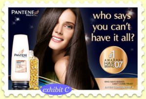
1. The Weasel Claim
2. The Unfinished Claim
3. The "We're Different and Unique" Claim
4.The "Water is Wet" Claim
5.The "So What" Claim
6. The Vague Claim
7. The Endorsement or Testimonial
8.The Scientific or Statistical Claim
9. The "Compliment the Consumer" Claim
10. The Rhetorical Question
Friday 12 May 2017
Thursday 11 May 2017
Deconstructing an Advertisement
Step 1: Make Observations
- There is a Mexican/Italian female that is depicted into this ad. She is young, stylish and beautiful. Her facial expression is seductive.
- The camera angle was straight on, as it covers all of her face and a little bit below the shoulders. It was definitely fairly close to her, and it was taken eye-level.
- I think it is most definitely artificial as the background is all white and she is illuminated to perfection because they want her looking as perfect as possibly and cant have any shadows on or across her face. Her skin and hair are definitely highlighted, I think this is so you can clearly see how perfect she is. there is one shadow outlining her jaw which is not big i think it is there just for the effect.
- Yellow is used on the little bubbles floating around and yes they are bright, yellow is also used on the word 'beautiful'. Everything else, her tank top is white, her hair is dark and brown, and her jewelry has a tint of gold to them. They do contract each other so this is a very vibrant advertisement.
- The text in the ad is very bold and easy to read. I think the font used is book antiqua for the Pantene writing, but I think the font for the rest of the writing is just calibri. All off the text is bold black except for the word beautiful. Which is only yellow. The large text says 'Fuel Your Hair' and the small text including the yellow word says 'Strong is Beautiful'.
Step 2: Determine the Purpose of the Ad
- The product being sold is shampoo.
- Yes I do, because it makes my hair soft and smell nice.
- The target audience for this ad is female teens and adults.
- The feelings and emotions that the ad is trying to associate with the product are envy for the women in the ad because she is so beautiful and may be trying to hit the insecurity feelings a touch due to the fact that if you want to look like her and that is the reason you use this shampoo then you must not love the way you look which means you may or may not have a little bit of insecurity about yourself. I imagine it does work on some girls, but personally i choose my shampoo by the scent and how it makes my hair feel.
Step 3: Determine the Assumptions the Ad Makes and the Messages it Sends
- The assumptions the ad makes about the gender is that women love their hair soft and they want to look like Selena Gomez. I think partially yes, every women wants their hair soft, but I disagree with the part that every woman wants to look like Selena Gomez, yes she is beautiful but not everyone wants to look like her. I think they enforce stereotypes about gender identity.
- I don't believe that there are really any assumptions about race within this ad. They could have used any beautiful celebrity and it would be the exact same thing, I think the biggest part of why they used Selena is not for her race but for her publicity.
- Again I don't think that there is any assumptions having to do with class, other than I suppose the fact of the person in the ad being a celebrity. Which therefore the assumption would be that everyone wants to look like her and because she is a celebrity, everyone will buy their product. I think it partially reinforces it because it is true in many cases that people will buy products based on whomever that celebrity is that is in the advertising.
Step 4: Consider the Possible Consequences of these Messages
- Some of the possible consequences of the words said in this ad are that women who can't buy this shampoo may feel like they aren't beautiful without it due to the words 'strong is beautiful'. This could be long-term or short-term, but to be honest I don't think people are really that crazy over the fact that a shampoo commercial says you can only be beautiful if you use this product.
- Having used this shampoo, it does make my hair feel great and strong, but on the other hand it does create unrealistic expectations because by having your hair strong by using this shampoo or any other will not make you any more beautiful.
- I think it undermines social change because there will certainly be a lot of girls who 'need' this shampoo because Selena Gomez uses it.
- I think that this ad is not socially responsible because it is not contributing anything to the environment, it is only taking away. For an ad or a company to be socially responsible they have to be selling or providing information to help the earth grow and be a better place, shampoo does not fall under that category.
- To think of yourself primarily as a citizen and not a consumer is to think about yourself doing good on this earth, rather than just buy things and support the companies that are destroying it. Yes, one can be both a citizen and a consumer, they just have to be smart about it like buying from local companies which will contribute to the small towns. This ad is definitely not encouraging to be a citizen, it fully supports you to be a prime consumer, and Pantene is a chain of shampoos that are sold all over, which means usually that it is all made in a factory in China or something by laborers.
Wednesday 10 May 2017
VAPID
Voice:
- The voice in this ad is the fish, asking to the audience if you would care more if they were pandas instead of fish.
- I believe that it is an authentic and credible voice speaking because it is true.
- This ad would appear on environmental sites, would be put up as posters around at environmental events or could be posted anywhere really.
- The ad is more so directed towards older people, that are environmentalists and care about our animals with a strong passion.
- The race could be all, the gender could be either and the age from their twenties to their fourties. It wouldn't be directed towards young kids because I feel like they wouldn't get anything out of it and wouldn't completely understand the meaning.
- I feel like the writer took a little bit unfair advantage to the reader because they are making them feel guilty because everyone cares about the pandas but doesn't care about the other animals that are also endangered.
Purpose:
- The apparent purpose of the ad I think is for people to care about the animals and help the endangered species.
- The actual purpose of the ad I believe is for the organization to gain money, by helping out the endangered animals you pay donations and with those donations they are able to have their company.
- No it doesn't
- There isn't a product being sold.
- The ad doesn't conceal anything about the product necessarily, but the company. A couple years ago when WWF did their white coca cola cans for the polar bears, there was a rumor going around that they were using child laborers to make them in the factories. So whether that was true or that they continue to do harmful things, I am not sure.
- The prime focus of the ad is to get people more aware about other animals that are endangered not just the precious pandas that everyone knows and cares about.
- This ad definitely appeals to emotion because many many people are emotional about the environment and especially animals.
- I think this ad appeals to one of the seven deathly sins, anger, because the fish are angry that humans only care about the pandas and not them.
- No it does not try to impress the reader with facts.
- Yes, it is true that humans are mostly about panda bears, Whenever we are asked to name an endangered animal, automatically pandas come to mind because they are the most advertised, even the WWF logo is of a panda bear.
Devices:
- The overall design of the ad is dark and gloomy because that's what they want you to think the fish's life is like. The ad provider wants you to think that the fish's life is awful because nobody cares about them, and the panda mask on the fish just adds to the affect the ad will have on people.
- The panda mask could be an attention-getting ploy as it is the only light coloured thing in a sea of dark.
- There are no people in the ad, but the species of fish is tuna.
- The fish are positioned in the ad coming towards us and kind of close together.
- Costume plays the biggest part in the ad as one of the fish is wearing a panda mask and that is what the whole ad is based around because if he were a panda he thinks humanity would care more for them.
- The setting is a dark ocean because they are in a dark place because they are endangered and their lives are of the line.
- In this ad the fish is the product so the fish are represented as being gloomy and lonely and well endangered in the dark ocean.
- the size of the fish with the mask is much bigger than all of the other ones so that it stands out and gets the point across easier. it is also bigger so that you can actually see that it is wearing a mask.
- The colour in this ad is mostly dark, navy blue for the ocean, black for the fish and white for parts of the panda. just an overall dark and gloomy picture.
- The only information on this ad besides the question, which is stating that the species of tuna is dying, but all we care about are the pandas and we don't even notice that they are dying. The other part of the text that you can notice is the WWF symbol which supports the reality of this ad.
- The ad is implying that tuna are being over fished and their numbers are going down drastically each year, but the only endangered animal humans are caring for are the pandas.
- The ad is stating a question that is asking if you would care about them if they were pandas rather than tuna.
- The question is large so that is clear and visible to read, but the text for the WWF is small and very very difficult to read.
- Yes, the small print is in front of the WWF logo, which may only say all of the copyright stuff, or it could be saying something else but we don't really know because it is so tiny and no one can read it.
Monday 8 May 2017
Questions To Ask When Reading An Ad
1. The overall effect of the design is to make it seem like the product is really hot. It is colourful but not busy, making it stand out better and the colour suggests that it is hot as it is red. But is also understated as it has a lot of empty space. Old-fashioned because the object in the ad is a fire extinguisher which has been around forever and isn't really new technology.
2. The image would immediately get your attention due to the fact that it is coloured bright red. The size of it is mediocre though, it is positioned in the center of the page which draws your attention to it more than if it were per say in the corner of the picture. It is kind of grotesque in the way that it is plain and its a fire extinguisher. As for humour, it is that kind of sarcastic humour, like its so hot that you need a fire extinguisher when you eat it.
3. The audience for this image I think would be men from the ages of 16-50. It really affects people who like their food spicy in reality, which could also be women, but spicy food is more common in men than in women I think.
4. I think this advertisement appeals to our adrenaline emotions (if those are a thing). By seeing this ad saying that this sauce is very hot, it plays with the daring side of us like 'oh man I've got to try that sauce it's supposed to be really hot'. Which by someone saying that gets someone else wanting to try it too because they are. Even if it does burn their mouths.
5. I don't really think that there is an ethical appeal to a bottle of hot sauce. It makes more of an emotional appeal to the fact of how hot it is and the people who love spicy food will have emotion while eating it.
6. The image and the text coincide with each other, there aren't many words on it and they are basically saying the same thing. If you see the picture it will lead you to read the words as well, or vice versa if you read the words it'll make you want to look at the picture as well/
Subscribe to:
Posts (Atom)